Ryan Smith Photography
Myrtle Beach Photographers
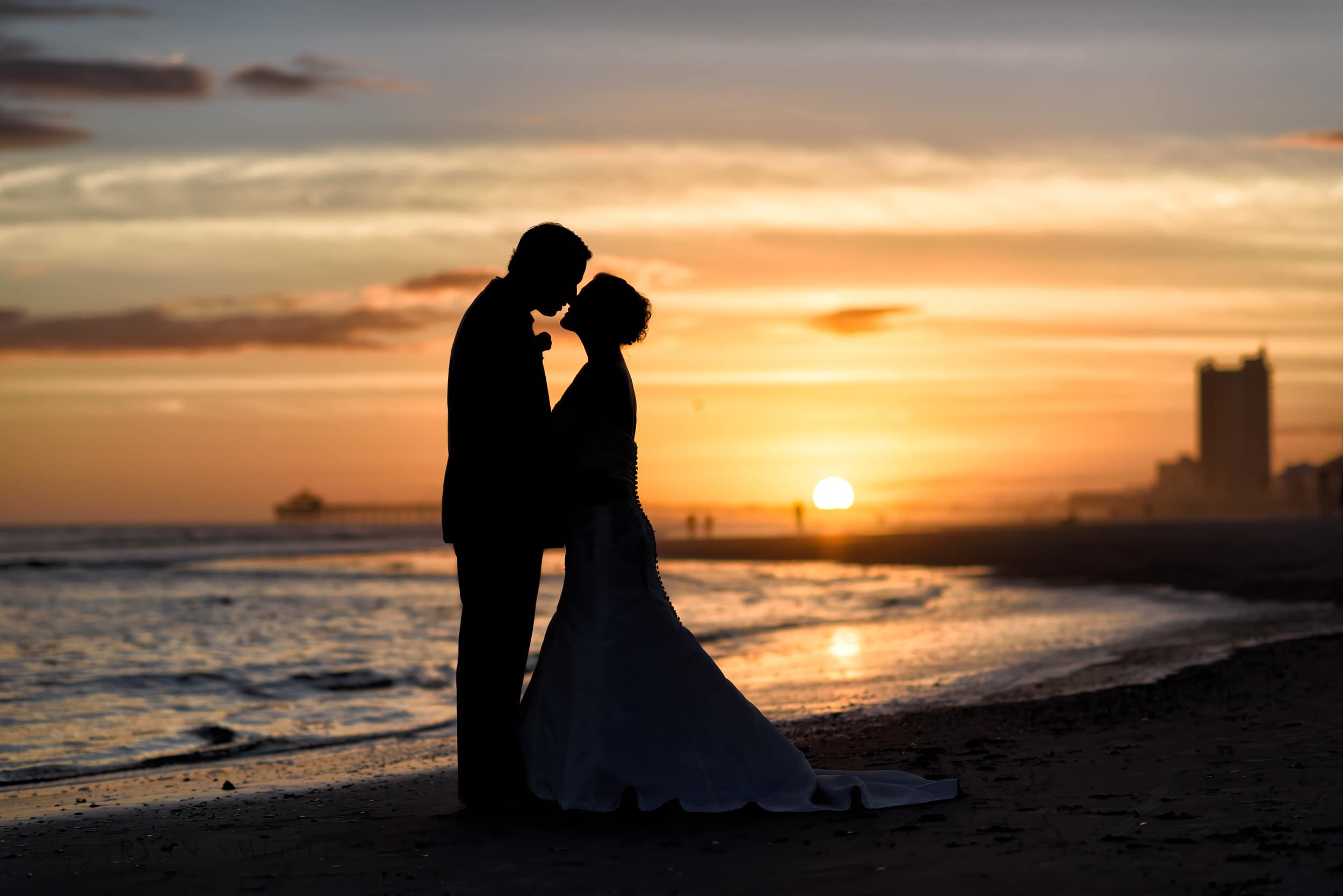
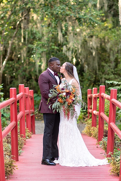
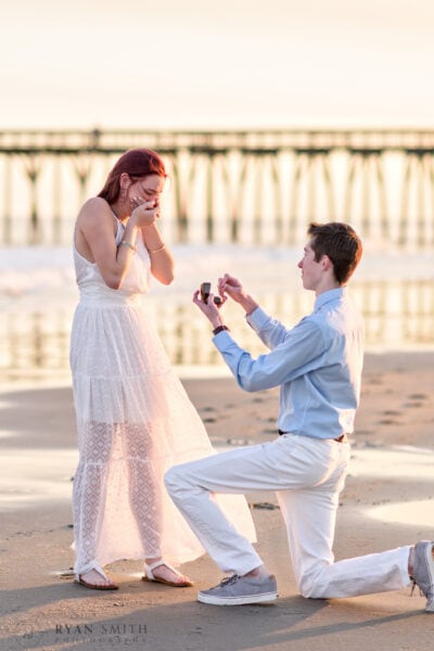
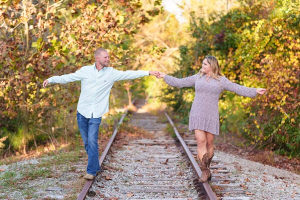
Welcome to Ryan Smith Photography! With over 15 years of experience as one of the top local photographers in Myrtle Beach, I pride myself on delivering exceptional service. My clean, crisp, and colorful images capture timeless moments that will always be in style. I use specialty prime lenses, skillful off-camera lighting, and careful editing for accurate color and proper exposure. My modern techniques ensure that every detail is captured flawlessly, from a bride’s white dress to the beautiful colors of a sunset.
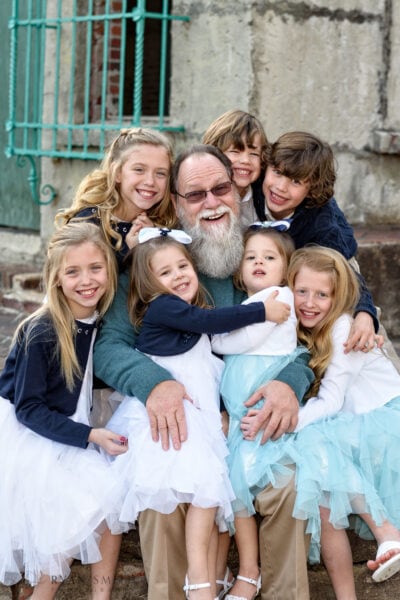
Clients have described me as high-energy, fun, and a pleasure to work with, and I’m always open to trying new ideas to create stunning photos. I capture genuine emotions using a relaxed, candid approach mixed with traditional posed portraits. Check out some of my reviews here. As a local small business, I do whatever I can to ensure my clients are happy and keep my excellent reputation. Please take some time and get to know my work by clicking below.
What type of photography are you looking for?
Why is Ryan Smith the best Myrtle Beach Photographer?
Local Small Business in Myrtle Beach for 15 Years
Starting my photography business in 2008 and capturing over one million unforgettable moments for my clients, I am one of the most experienced photographers in the Myrtle Beach area.
As a small, local business based in Myrtle Beach, I believe in building relationships with my clients. You can always count on working directly with me, from scheduling the shoot to adjusting and delivering the final images. I hope a new client will be a future repeat customer for years to come.
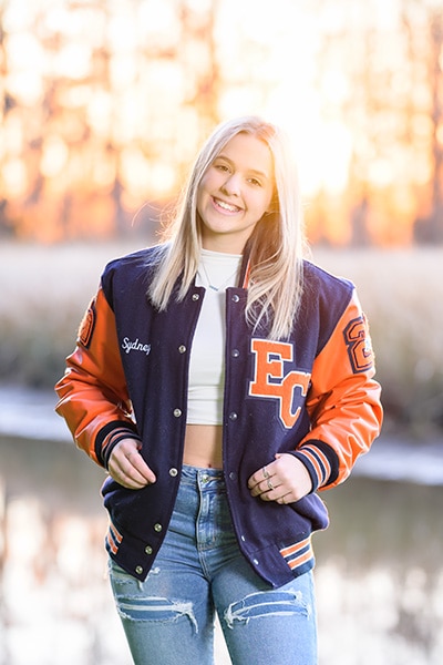
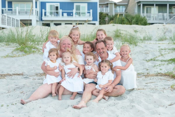
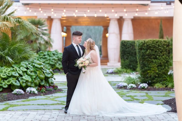
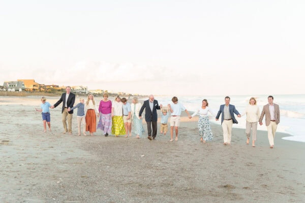
With my 15+ years of experience, I’ve learned how to create a fun and relaxed atmosphere during photo sessions, which helps to capture natural smiles and genuine emotions. Whether I’m photographing a hectic wedding or a large family group, I bring out the best in my subjects.


Capturing Timeless Moments with Modern Techniques
I use off-camera flash techniques to combine the look of an in-studio portrait with the natural beauty of outdoor settings. You will always see a bright sparkle in my subject’s eyes and bright, well-lit faces. Check out my blog’s many thousands of pictures to see the benefits of my portrait lighting.
I exclusively use high-end prime lenses, which allow me to capture stunning, crisp images of my subjects with beautiful, dreamy, blurred backgrounds. The latest Sony cameras create super detailed images with eyes always in focus.
Photography is about capturing timeless moments that will be treasured for years. That’s why I create natural, authentic images without relying on artificial filters or effects. By focusing on realistic colors and lighting, my pictures will look just as stunning in 50 years as they do today.
My prices are very affordable, from full-day wedding packages to family, engagement, or senior portrait sessions on the beach. Please check out my various links above or contact me for more information.
Latest Reviews
Ryan was the exact professional I was looking for! During our family vacation at Myrtle Beach, I knew(...)
Ryan did a fantastic job capturing both our engagement and wedding photos. We enjoyed having him(...)
Ryan was quick to respond to our inquiry about taking our family pictures, and he was very flexible(...)
Ryan Smith is an excellent photographer, and my fiancé and I had a great time working with him! Ryan(...)
Comments are closed.